
📖Book update: Look, feel, and navigation
We decided to write this book together because we weren't arguing enough

One thing I've learned in 30 years of writing is that breakthroughs often come when I’m distracted or doing something else rather than staring at words on a screen. It can happen on a walk, in the shower, while playing a game, or, in some cases, even when I'm asleep. My mind is elsewhere, and suddenly–bam!–an answer appears as if out of nowhere.
That's what happened in mid-October. We were so innocent then.
We had started, regrouped, and then restarted this book project at least twice over the late summer, and it was all my fault. I've written many books over the years, mostly in isolation, and mostly using fairly technical tools that wouldn't appeal to most. So collaborating with Stephanie on this book has been challenging. For me, because she works and writes differently than I do, like a normal person. And for her, because she has to deal with me.
We did agree that we needed to get something published while we were in Mexico most recently, ideally by the end of October. And we were working, and making progress. But something was gnawing at me. I never voiced my worries, and we even recorded a book update video for our YouTube channel based on the plan we had made heading into that trip. But one night, at 3:30 am, I woke up with a start after dreaming about the book and a new way to structure things that would be more modular and would let us move forward more easily.
All I had to do was change everything.
So I got out of bed, closed the door to the bedroom, made coffee, and got to work. Over the next three hours or so, I recreated the book from scratch yet again, pulling in the content from the previous version as I went. And by the time Stephanie woke up at a more acceptable time, I showed her what I had done. I had figured out a new way forward, it made sense, and it would work. She agreed and told me she had been silently worrying about how we would get everything done in whatever time frame we had previously agreed to. For that brief, shining moment, I could see it.
Again, we were so innocent then. The change I made at that time was a major improvement to the underlying structure of the book, and it was the right thing to do. But as I write this, it's two months later and we still haven't published our first preview of the book.
I won't bore you with the back-end technical structure of the book, or the various permutations we've used over time. But we've been working on this book since August, Stephanie writing and me splitting my time between writing and working on that back-end. And three big changes came out of that 3:30 am wake-up call that will impact readers of the book. And that's what I'd like to discuss today.
The first is related to how the book is organized.
I can't imagine that many others have ever thought about this. I certainly hadn't. But there are many ways to organize the contents of a book like this, some logical, some less so, and we've likely tried every way there is. For example, early on, I envisioned the book being centered on Roma Norte, because that is where we spend the most time and have the most experience. It could be like concentric circles emanating from our apartment, with lots of content about nearby places, and less so the further away you got, and ... that doesn't make any sense. Obviously. In the end, a traditional Rick Steves-like guidebook organization took hold.
The second is presentation.
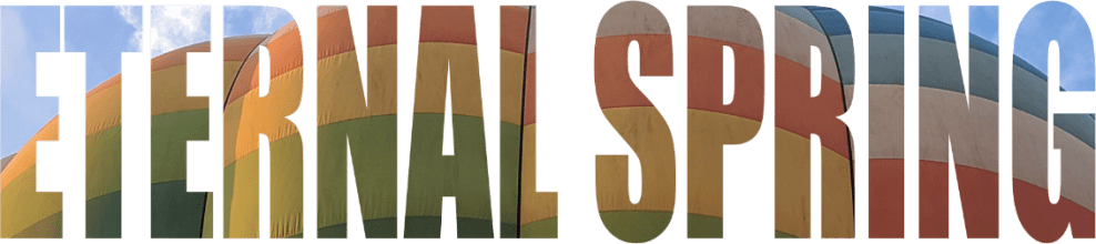
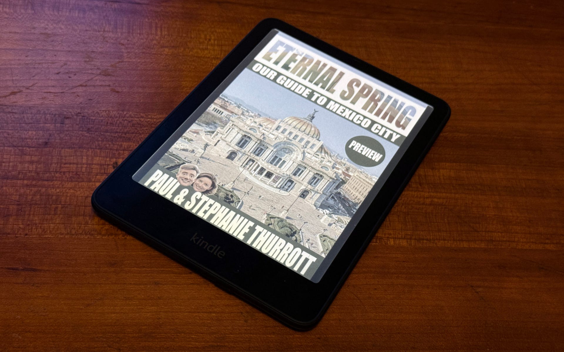
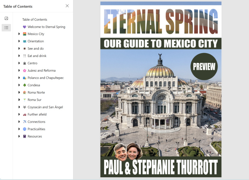
The books I've self-published over the past 12 years or so are technical in nature, and with one exception, most of the images in these books are screenshots, not photos. I wanted the Eternal Spring book to be attractive, even photo-heavy. But I knew from experience this would be difficult if not impossible, and so I experimented over many months with many ways to present the content. I still have some ideas about a prettier presentation with magazine-like layouts—maybe interesting, maybe not, it's something we'll show you later and see what you think—but in the end, we had to go back to a traditional e-book presentation. Which is pretty dull, frankly: You can have images between bodies of text, but there's no real support for anything more complex–an image next to some text, God forbid—because it has to work on Kindles and small phone screens, and it can't be too big or you won't be able to easily download it to, or use it on, those devices.
So I made some compromises that we think make the book as it now stands look reasonably attractive, given the technical limitations, and, as importantly, improve usability.
We're going to have a lot of images, but they have a short and wide 2.39:1 aspect ratio, as opposed to more typical 4:3, 16:10, or 16:9 images that would take up more vertical space and make the book harder to read on a small device.
Early on, we created a mammoth template for restaurant and bar reviews, and while we're still using that for our longer reviews, we've condensed it quite a bit and replaced information we'd have to keep up to date—operating hours, especially—with links to the locations' Google Maps entry, website, and/or social media presence. But one thing we retained was the colorful emojis we were using for ratings, cost, and pros and cons. A set of visual elements we really like for being obvious at-a-glance:
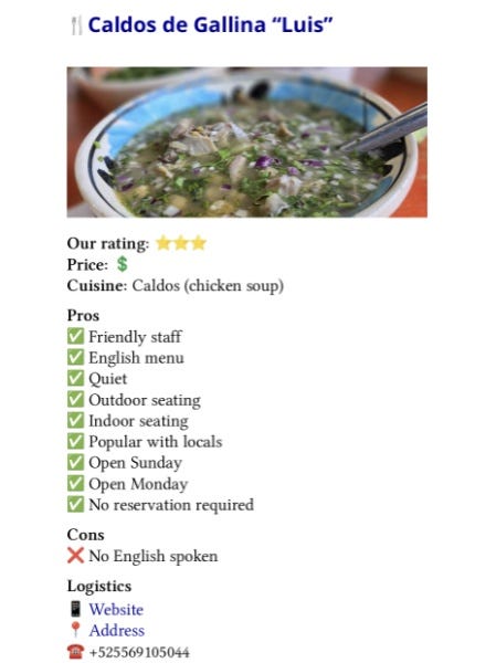
In fact, we liked this design so much that I later suggested adding emojis all over the book, which would add color and, I felt, another kind of at-a-glance nicety. As I write this, there are countless emojis in the book, alongside things like heading and place names. But this is one of many things we need feedback about. Maybe it's too much. Maybe it's distracting. Or maybe it's curiously perfect. We're interested in finding out what readers think.
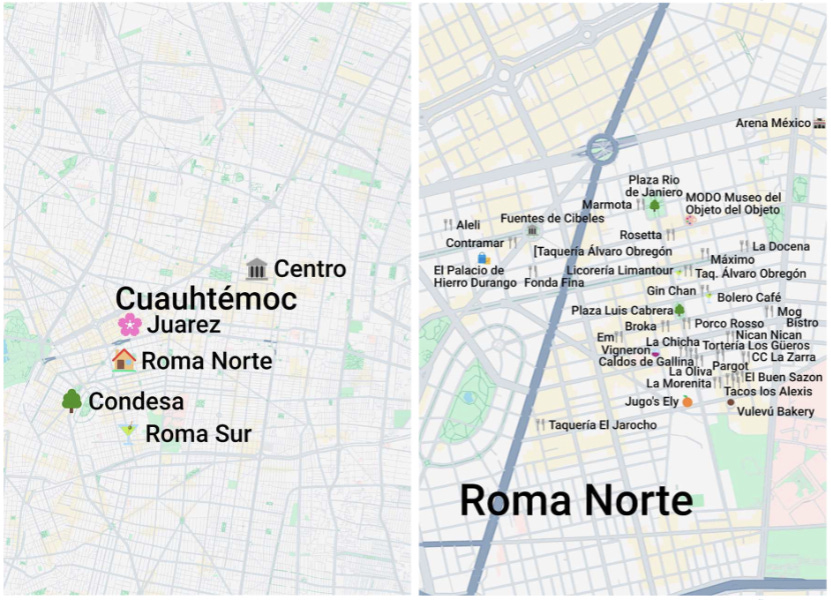
The third change is related to maps, and so it's also related to our refining of our review template. One of the many things that's always bothered me about the Rick Steves books—literally, this dates back 25 years—is the low quality and inaccuracy of their hand-drawn black and white maps. I can't think of anything more useless, and I was determined to arrive, somehow, and at some point, on a solution to this problem for our book. I wanted beautiful maps.
Our maps were not beautiful for a long time. I struggled with this for months, went down the rabbit hole of researching every online map service imaginable and trying each, often more than once. At some point in late summer, I finally gave in and decided to simply use Google My Maps, a Google Maps sub-service that hasn't received a meaningful update in years, just so I could stop obsessing over this and spend more time writing.
The problem is that custom maps created with My Maps can be pretty but full of superfluous sponsored locations, or ugly but with less of that. What I settled on was the latter. And so the maps I was making looked like so.
This is ... OK. But it's also kind of an ugly brown color that looks nothing like Google Maps, and when I placed them in the book, it made me unhappy.
So I went down that rabbit hole yet again, and finally mastered a service I had found earlier, called Snazzy Maps, which lets me use the default Google Maps style but with no superfluous locations, sponsored or otherwise, to create the maps I put in the book. They are now full-page, "full bleed" (edge-to-edge) images that often look spectacular. Here are two examples, one with minimal content and one that is pretty dense.
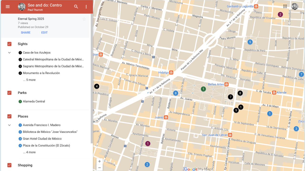
I also made many headings—for chapters that are location-based, like those for Roma Norte and Condesa—and for place names tied to our review links to maps in Google Maps. And we still use Google My Maps for those because, again, most people will access this book on their phones, and they will have Google Maps on those devices and will want the maps to open in that app. It all kind of came together from a navigational perspective. I hope.
I sometimes joke that Stephanie and I decided to write this book together because we weren't arguing enough. And it bothers me that this has taken so long. But it's getting there. Finally.
Almost across the finish line! We're rooting for y'all. I know it's been a lot of work but it will totally be worth it.
The subtitle 😂
Congratulations to you both! Wondering if the concentric circles are still evident in the book, even if you didn't go that way structurally in the end?
Also, where can we get it, I need to see the maps.